
Now that we have observed Halloween and All Saints Day, check out this beautiful and interactive collection of metro logos from around the world. (Alas, the logos for Orlando’s budding “SunRail” system or San Juan, Puerto Rico’s “Tren Urbano” are not included in this fairly comprehensive collection of metro logos.) Which one do you like the best? Least? Hat tip: @kottke.
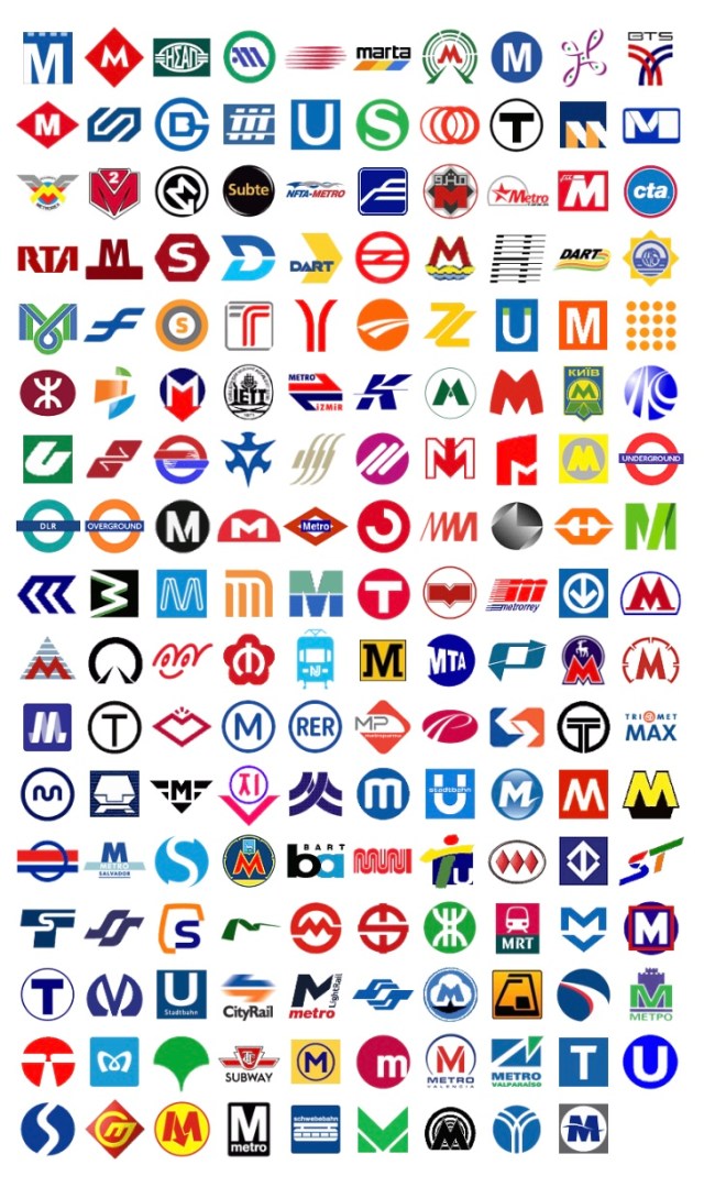


Interesting how so many of the logos rely on “M” or “T” and relatively few depict objects like wheels, vehicles, etc. The most important purpose of a transit logo is to be immediately identifiable on the street — at stations, on vehicles, etc. Many of these logos look more like gas station brands. I would have designed a logo with a person (gasp!) sitting in a seat beside a window — universal! I see only one logo (seventh column, 5 rows up from bottom) that even abstractly suggests a person.