
As you may have heard by now, there are more cases of coronavirus in the USA than anywhere else in the world. But with apologies to the late Darrell Huff, most coronavirus tables and charts I have seen thus far tend to focus on the absolute or total number of infections or deaths per country or region, instead of adjusting these dreadful data for population, like the chart below does. Notice how, once we adjust for population size, the USA is not (yet) the most lethal location for this virus.
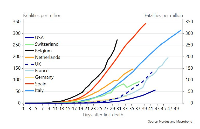
Finally, a coronavirus chart that adjusts the data for population!

